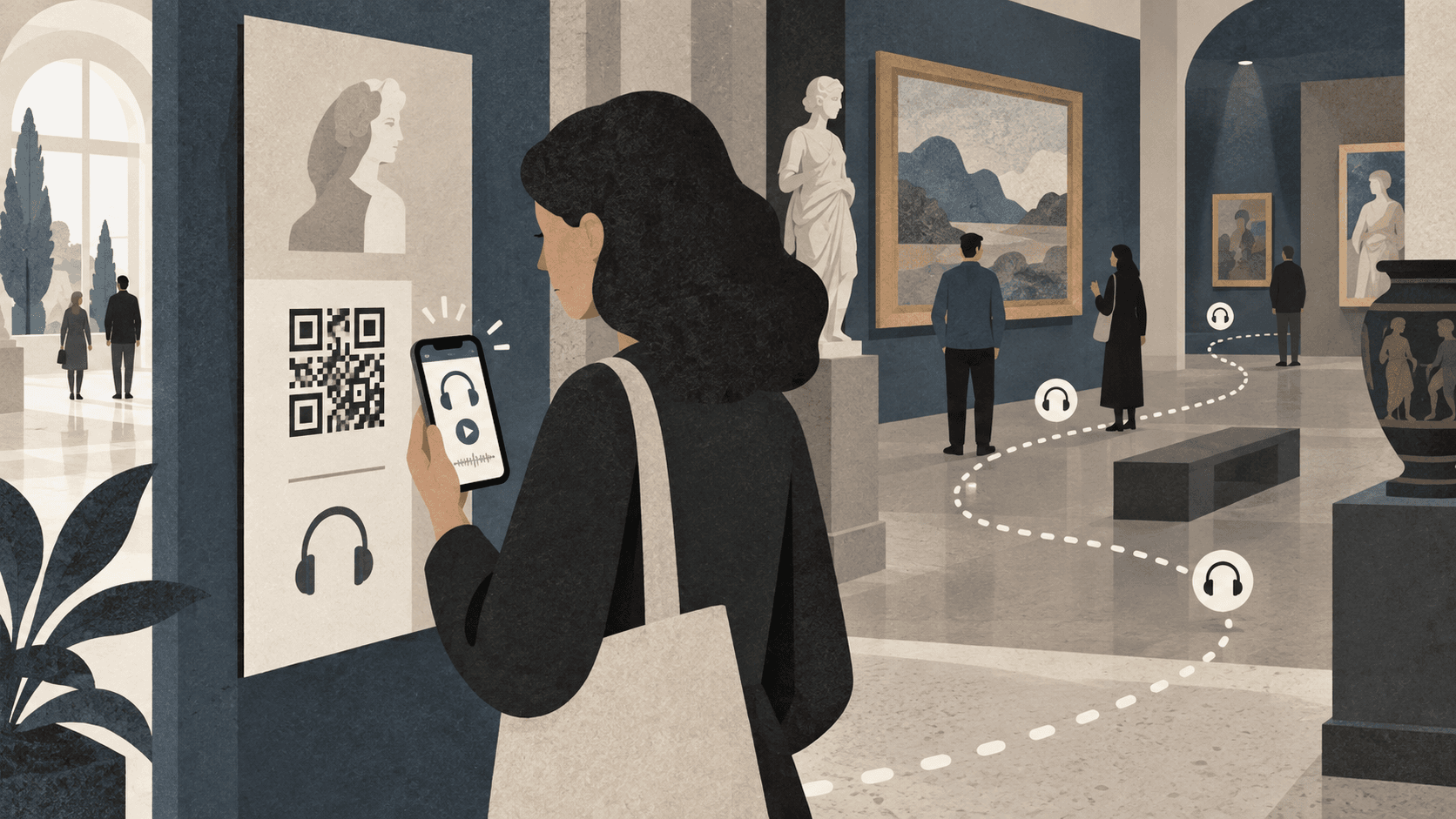
A QR code is an invitation, not an instruction
Visitors decide quickly whether scanning is worth the interruption. A lone black-and-white square creates uncertainty: What will open? Is it free? Will it ask for personal data? Pair the code with a direct promise such as “Hear the artist’s story—free, no download.”
Use one clear starting point
A main code at the entrance should open the guide’s welcome or track list. Numbered labels near objects then help visitors connect the physical exhibition to the corresponding audio. Avoid a different QR code for every track unless the route makes number entry impossible; too many codes add visual noise and make recovery harder when a label is damaged.
- Keep a quiet border around the code
- Print large enough for the likely scanning distance
- Use strong light–dark contrast
- Test the final printed material, not only the screen file
Remove the digital waiting room
The best first interaction is the content itself. Do not require registration, cookie choices for unnecessary marketing tools, or an app download before visitors can listen. A web guide provides universal reach; platform features such as an iOS App Clip can add a more native experience without a traditional installation.
Design for the building
Mobile reception, glare, crowded entrances, and accessibility needs all affect the scan. Test in the venue at busy times. Provide a short written URL as a fallback, place codes within comfortable reach, and make sure instructions are readable without blocking circulation.
Measure success beyond scans
A scan only shows that someone opened the guide. More useful questions are whether they started a track, explored another stop, selected a language, and stayed engaged. Combine privacy-conscious usage patterns with brief staff observations and visitor conversations.